Getting started#
This notebook shows the basic usage of the PyRASA package.
[1]:
from neurodsp.sim import sim_combined
from neurodsp.utils import create_times
import numpy as np
import scipy.signal as dsp
import matplotlib.pyplot as plt
import pandas as pd

#add random seed for reproducibility of readme example
np.random.seed(42)
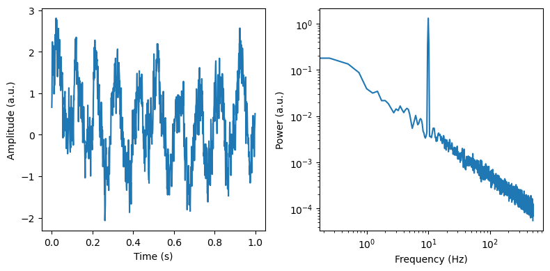
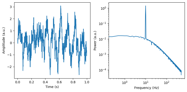
We first simulate a signal with a single oscillation and a spectral slope of -1
[3]:
fs = 1000
n_seconds = 60
duration=4
overlap=0.5

sim_components = {'sim_powerlaw': {'exponent' : -1},
                  'sim_oscillation': {'freq' : 10}}


sig = sim_combined(n_seconds=n_seconds, fs=fs, components=sim_components)
times = create_times(n_seconds=n_seconds, fs=fs)

max_times = times < 1
f, axes = plt.subplots(ncols=2, figsize=(8, 4))
axes[0].plot(times[max_times], sig[max_times])
axes[0].set_ylabel('Amplitude (a.u.)')
axes[0].set_xlabel('Time (s)')
freq, psd = dsp.welch(sig, fs=fs, nperseg=duration*fs, noverlap=duration*fs*overlap)
axes[1].loglog(freq, psd)
axes[1].set_ylabel('Power (a.u.)')
axes[1].set_xlabel('Frequency (Hz)')

plt.tight_layout()
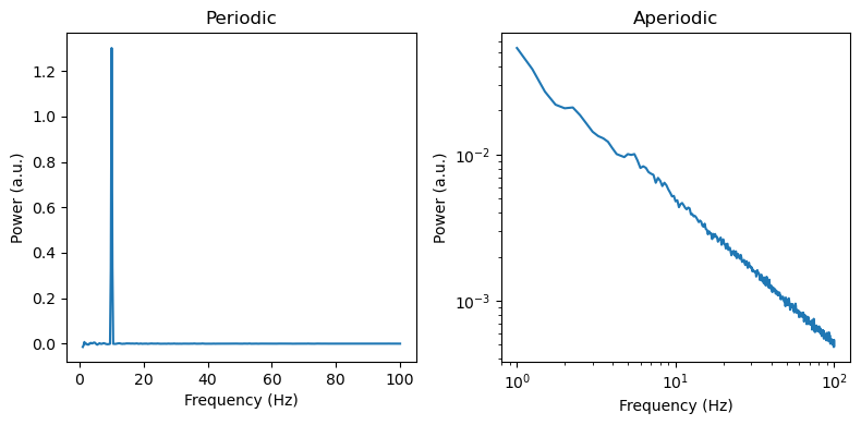
Now we can use IRASA to seperate the signal in its periodic and aperiodic components
[4]:
from pyrasa import irasa

irasa_out = irasa(sig,
                    fs=fs,
                    band=(1, 100),
                    nperseg = duration*fs,
                    noverlap = duration*fs*overlap,
                    hset_info=(1, 2, 0.05))

f, axes = plt.subplots(ncols=2, figsize=(8, 4))

axes[0].plot(irasa_out.freqs, irasa_out.periodic[0,:])
axes[1].loglog(irasa_out.freqs, irasa_out.aperiodic[0,:])

for ax, title in zip(axes, ['Periodic', 'Aperiodic']):
    ax.set_title(title)
    ax.set_ylabel('Power (a.u.)')
    ax.set_xlabel('Frequency (Hz)')

f.tight_layout()
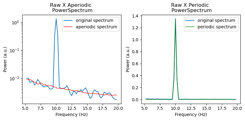
We can also use a convenience plotting function to visually inspect the separation of periodic and aperiodic activity using the IRASA method
[5]:
irasa_out.plot(log_x=False,
               freq_range=(5, 20),
               average_chs=False)
Lets check whats stored in the IrasaSpectrum returned by irasa
Now we can further analyse the periodic and aperiodic components using the get_peak_params and compute_slope functions, which will return pandas dataframes containing specific information about the slope or the oscillatory parameters.
[6]:
# %% get periodic stuff
irasa_out.get_peaks()
[6]:
| ch_name | cf | bw | pw | |
|---|---|---|---|---|
| 0 | 0 | 10.0 | 1.188439 | 0.506288 |
[7]:
# %% get aperiodic stuff
aperiodic_fit = irasa_out.fit_aperiodic_model()
aperiodic_fit.aperiodic_params
[7]:
| Offset | Exponent | fit_type | ch_name | |
|---|---|---|---|---|
| 0 | -1.330567 | 1.014195 | fixed | 0 |
[8]:
aperiodic_fit.gof
[8]:
| mse | R2 | R2_adj. | BIC | BIC_adj. | AIC | fit_type | ch_name | |
|---|---|---|---|---|---|---|---|---|
| 0 | 0.000386 | 0.997517 | 0.997505 | -35.059446 | -41.405504 | -43.027319 | fixed | 0 |
But how does all of this work in practice? The beauty of IRASA lies in its simplicity. Essentially, its just up/downsampling and averaging. I will deconstruct the algorithm below to show you its inner workings and highlight potential pitfalls.
We start by simply computing a psd
[9]:
kwargs_psd = {'nperseg': duration*fs,
              'noverlap': duration*fs*overlap}

freq, psd = dsp.welch(sig, fs=fs, **kwargs_psd)

f, ax = plt.subplots(figsize=(4,4))
ax.loglog(freq, psd)
ax.set_ylabel('Power')
ax.set_xlabel('Frequency (Hz)')
[9]:
Text(0.5, 0, 'Frequency (Hz)')
Now we need to create two other psds from an up-/downsampled version of the data. Note that the data is up-/downsampled by the same factor
[10]:
import fractions

resampling_factor = 1.5

def simple_rasa(resampling_factor):
    rat = fractions.Fraction(str(resampling_factor))
    up, down = rat.numerator, rat.denominator

    # Much faster than FFT-based resampling
    data_up = dsp.resample_poly(sig, up, down, axis=-1)
    data_down = dsp.resample_poly(sig, down, up, axis=-1)

    # Calculate an up/downsampled version of the PSD using same params as original
    _, psd_up = dsp.welch(data_up, fs * resampling_factor,  **kwargs_psd)
    _, psd_dw = dsp.welch(data_down, fs / resampling_factor, **kwargs_psd)

    return psd_up, psd_dw


psd_up, psd_dw = simple_rasa(resampling_factor)

f, ax = plt.subplots(figsize=(4,4))
f_max = freq < 100
ax.loglog(freq[f_max], psd[f_max], color='k', label='original')
ax.loglog(freq[f_max], psd_up[f_max], color='b', label='upsampled (factor = 1.5)')
ax.loglog(freq[f_max], psd_dw[f_max], color='r', label='downsampled (factor = 1.5)')
ax.set_ylabel('Power')
ax.set_xlabel('Frequency (Hz)')
plt.legend()
[10]:
<matplotlib.legend.Legend at 0x164f67c50>
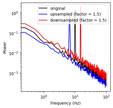
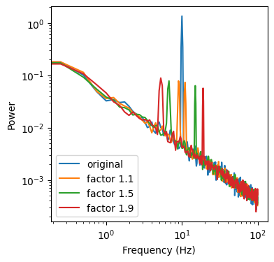
We can see that up-/downsampling shifted the peak (oscillation) in the spectrum relative to the original data. Now we compute the geometric mean of the up-/downsampled version of the data and repeat the procedure for a different resampling factor. We can see that this creates a version of the original data with 2 peaks that are shifted around the original peak by a factor of x.
[11]:
psd_up_19, psd_dw_19 = simple_rasa(1.9)
psd_up_11, psd_dw_11 = simple_rasa(1.1)

gmean = lambda x, y : np.sqrt(x * y)

f, ax = plt.subplots(figsize=(4,4))
f_max = freq < 100
ax.loglog(freq[f_max], psd[f_max], label='original')
ax.loglog(freq[f_max], gmean(psd_up_11, psd_dw_11)[f_max], label='factor 1.1')
ax.loglog(freq[f_max], gmean(psd_up, psd_dw)[f_max], label='factor 1.5')
ax.loglog(freq[f_max], gmean(psd_up_19, psd_dw_19)[f_max], label='factor 1.9')
ax.set_ylabel('Power')
ax.set_xlabel('Frequency (Hz)')

plt.legend()
[11]:
<matplotlib.legend.Legend at 0x16612fd90>
Now we can compute the median, between our 3 geometric means to obtain our aperiodic spectrum. In reality we use a bit more than 3 up-/downsampling factors, but on this data its enough to get a decent spectrum
[12]:
aperiodic_spectrum = np.median([gmean(psd_up_11, psd_dw_11),
                                gmean(psd_up, psd_dw),
                                gmean(psd_up_19, psd_dw_19)], axis=0)

f, ax = plt.subplots(figsize=(4,4))
f_max = freq < 100
ax.loglog(freq[f_max], psd[f_max], label='original')
ax.loglog(freq[f_max], aperiodic_spectrum[f_max], label='aperiodic spectrum')
ax.set_ylabel('Power')
ax.set_xlabel('Frequency (Hz)')

plt.legend()
[12]:
<matplotlib.legend.Legend at 0x166397c50>
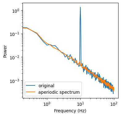
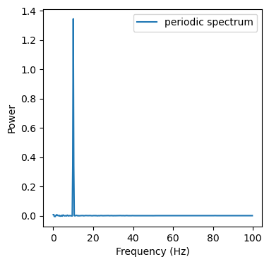
But how do we get the periodic spectrum? Its actually quite simple. We just need to subtract our aperiodic spectrum from the original spectrum.
[13]:
f, ax = plt.subplots(figsize=(4,4))
f_max = freq < 100
ax.plot(freq[f_max], psd[f_max] - aperiodic_spectrum[f_max], label='periodic spectrum')
ax.set_ylabel('Power')
ax.set_xlabel('Frequency (Hz)')

plt.legend()
[13]:
<matplotlib.legend.Legend at 0x16576bc90>
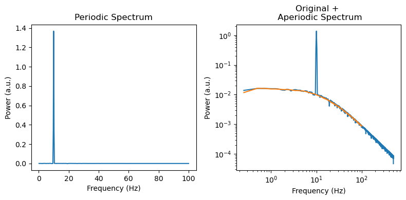
Now we can do slope fits on the aperiodic spectrum or do peak detection on the periodic spectrum. However, this was quite a simple spectrum and reality is usually much messsier and noisier. For instance we might get spectra that dont linearly decrease with frequency by the same value but have a deflection point (spectral knee) at which the slope starts changing. We can also deal with those using IRASA. See below for how we would do this.
[14]:
# %% Lets check the knee
knee_freq = 15
exp = 1.5
knee = knee_freq ** exp
duration=4
overlap=0.99

sim_components = {'sim_knee': {'exponent1' : -.0, 'exponent2': -1*exp, 'knee':knee },
                  'sim_oscillation': {'freq' : 10}}

sig = sim_combined(n_seconds=n_seconds, fs=fs, components=sim_components)

# %%
max_times = times < 1
f, axes = plt.subplots(ncols=2, figsize=(8, 4))
axes[0].plot(times[max_times], sig[max_times])
axes[0].set_ylabel('Amplitude (a.u.)')
axes[0].set_xlabel('Time (s)')
freq, psd = dsp.welch(sig, fs=fs, nperseg=duration*fs, noverlap=duration*fs*overlap)
axes[1].loglog(freq, psd)
axes[1].set_ylabel('Power (a.u.)')
axes[1].set_xlabel('Frequency (Hz)')

plt.tight_layout()
[52]:
irasa_out = irasa(sig,
                    fs=fs,
                    band=(.1, 100),
                    nperseg=duration*fs,
                    noverlap=duration*fs*overlap,
                    average='mean',
                    detrend='linear',
                    hset_info=(1, 2., 0.05))
[53]:
f, axes = plt.subplots(ncols=2, figsize=(8, 4))
axes[0].plot(irasa_out.freqs, irasa_out.periodic[0,:])
axes[0].set_ylabel('Power (a.u.)')
axes[0].set_xlabel('Frequency (Hz)')
axes[0].set_title('Periodic Spectrum')


axes[1].loglog(freq[1:], psd[1:], label='psd')
axes[1].loglog(irasa_out.freqs, irasa_out.aperiodic[0,:])
axes[1].set_ylabel('Power (a.u.)')
axes[1].set_xlabel('Frequency (Hz)')
axes[1].set_title('Original + \n Aperiodic Spectrum')

f.tight_layout()
f.savefig('../simulations/example_knee.png')
[54]:
# %% get periodic stuff
irasa_out.get_peaks()
[54]:
| ch_name | cf | bw | pw | |
|---|---|---|---|---|
| 0 | 0 | 10.0 | 1.188434 | 0.513117 |
[55]:
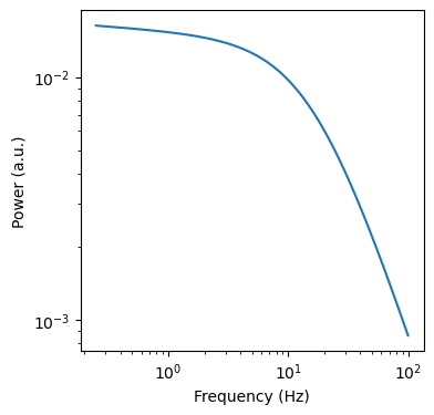
aps = irasa_out.fit_aperiodic_model(fit_func='knee').aperiodic_params
aps
[55]:
| Offset | Knee | Exponent_1 | Exponent_2 | fit_type | Knee Frequency (Hz) | tau | ch_name | |
|---|---|---|---|---|---|---|---|---|
| 0 | 2.415560e-13 | 64.458932 | 0.035615 | 1.481816 | knee | 14.621432 | 0.010885 | 0 |
[57]:
# %% get aperiodic stuff
ap_f = irasa_out.fit_aperiodic_model(fit_func='fixed')
ap_k = irasa_out.fit_aperiodic_model(fit_func='knee')
[58]:
pd.concat([ap_f.gof, ap_k.gof])
[58]:
| mse | R2 | R2_adj. | BIC | BIC_adj. | AIC | fit_type | ch_name | |
|---|---|---|---|---|---|---|---|---|
| 0 | 0.014817 | 0.884090 | 0.883507 | -13.253004 | -19.599137 | -21.235933 | fixed | 0 |
| 0 | 0.000102 | 0.999205 | 0.999197 | -31.124177 | -43.816442 | -47.090035 | knee | 0 |
[59]:
f, ax = plt.subplots(figsize=(4,4))
ax.loglog(ap_k.model['Frequency (Hz)'], ap_k.model['aperiodic_model'])
ax.set_xlabel('Frequency (Hz)')
ax.set_ylabel('Power (a.u.)')
[59]:
Text(0, 0.5, 'Power (a.u.)')
[60]:
ap_k
[60]:
AperiodicFit(aperiodic_params=         Offset       Knee  Exponent_1  Exponent_2 fit_type  \
0  2.415560e-13  64.458932    0.035615    1.481816     knee

   Knee Frequency (Hz)       tau ch_name
0            14.621432  0.010885       0  , gof=        mse        R2   R2_adj.        BIC   BIC_adj.        AIC fit_type  \
0  0.000102  0.999205  0.999197 -31.124177 -43.816442 -47.090035     knee

  ch_name
0       0  , model=     Frequency (Hz)  aperiodic_model fit_type ch_name
0              0.25         0.016267     knee       0
1              0.50         0.015814     knee       0
2              0.75         0.015516     knee       0
3              1.00         0.015277     knee       0
4              1.25         0.015066     knee       0
..              ...              ...      ...     ...
395           99.00         0.000875     knee       0
396           99.25         0.000872     knee       0
397           99.50         0.000869     knee       0
398           99.75         0.000865     knee       0
399          100.00         0.000862     knee       0

[400 rows x 4 columns])
[ ]: